Our brains are wired to scan and select in seconds.
Social media platforms have us hooked by exploiting this part of our brain. It's super easy to scroll for ours and thumb-stop on the videos & images that are most interesting to us.
For content creators making short-form or long-form content, the era of pure text content is fading and the era of highly-visualized
Even Twitter/X, famously short-form text, is inundated with imagery, videos, and charts to capture our attention.
There are two primary reasons for data visualization tools:
- Create powerful dashboards for executives & team members to move work forward
- Bring data to life in a more scannable, visual way
In the past, these were two separate business units and approaches, but my philosophy is that more and more these will become intertwined. Storytelling is extremely powerful in business, and the greats like Elon Musk know how to inspire their teams and drive innovation with powerful storytelling that leads to massive action. Elon doesn't tell Tesla employees that they work at an automobile manufacturer. No, they work at an autonomous robotics company ushering in the next age of human progress, and the current step they're working on is self-driving and humanoid robots.
Data visualization tools can help visualize all the data generated by business processes and create dashboards to keep track of pretty much everything. These tools are also perfect for creating graphics with data about specific events, projects, and information.
We’ve put together this list of tools to help you choose the best one for your needs.
1. Flourish Studio – best for easy, yet advanced beautiful visualizations
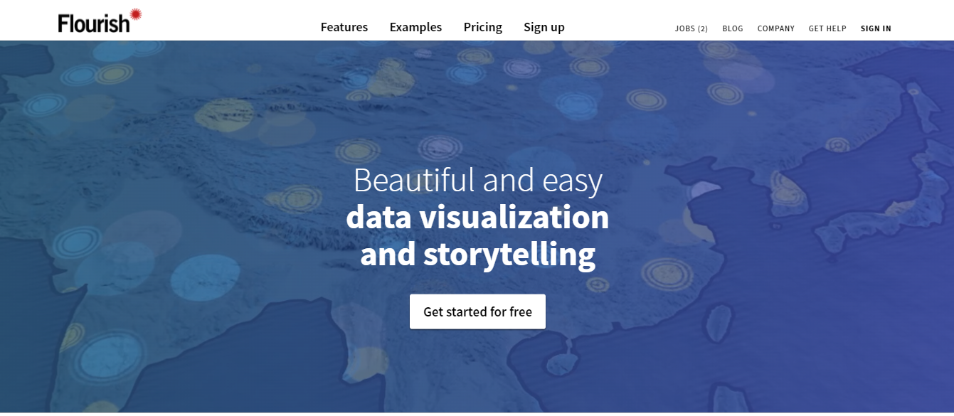
Flourish is amazing and probably my number one recommendation for beginners and experts alike that want an easy, no-code data visualization solution with a lot of graphs and options.
They have a very generous public free plan that gives you most of what you need, including a good amount of advanced visualizations.
For larger datasets, the tool allows you to upload spreadsheets or paste from Excel which you can turn into charts, maps, and interactive stories. It is extremely straightforward with no coding required and they have a very flexible template library. Once you’ve finished your visualization you can embed it on your own site or download the raw files.
Pricing:
- Public – $0/month
- Personal – $69/month
- Business – Custom
- Enterprise – Custom
My take on pricing: I appreciate that Flourish has a very generous free plan, but also has an approachable Personal plan with premium features. This is in direct contrast to Datawrapper that doesn't have much of an in-between plan before you start going corporate and enterprise.
Top Features:
- Stunning visualization
- Animated slideshows
- Unlimited flexibility
Flourish Premium Features
These are the top Flourish features available on premium plans – Publisher & Enterprise:
- Scrollytelling: build out an immersive scrolling experience like NY Times and other premium publications have
- Live data visualizations: connect to Google Sheets
Full Pricing and Features Table
| Public | Personal | Business | Enterprise |
|---|---|---|---|
| $0/month | $69/month | Custom Price | Custom Price |
| All data and projects public | Everything in Public | Everything in Personal | Scalable team size |
| Share or embed projects | Keep your data and projects private | Custom theme with Google font | Bespoke themes in your fonts/styles |
| Create stories and presentations | Email support | Password-protected publishing | Premium templates and features |
| Mobile and tablet friendly | Connect to live CSV or Google Sheets | Embeds and scrollytelling in your CMS | |
| Remove Flourish attribution | MSA, SLA and security processes | ||
| Account manager and priority support | |||
| Customization, training and services | |||
| Videos for presentations and social | |||
| SDK for private custom templates | |||
| Integrate with your analytics system | |||
| API for integration anywhere | |||
| SAML-based SSO |
Flourish Examples
Check out the Flourish Examples gallery for all the latest global examples.
Here are a few more found in the wild.
Can American Moves Affect the 20204 Presidential Election?
This post from moveBuddha researches how recent migration trends might be affecting the upcoming presidential election.
Comparing Flourish vs Alternatives
Flourish is awesome, but not always the right fit for every project.
Flourish vs Datawrapper
Flourish and Datawrapper are close alternatives to each other. You'll do well with starting with either one, and the skills you learn in manipulating the data and configuring the visualizations will very much translate to jumping over to the other tool, so pick whichever one looks closer to what you're liking, then try the other one before you specialize in one over the other.
Flourish is more creative. My team and I have found Flourish has a wider array of creative charts, such as bubble and timeline visualizations that Datawrapper doesn't have, so we prefer Flourish in these scenarios.
Datawrapper allows more fine-tuned customizations. That being said, when you need more flexibility and customization, we've found Datawrapper has more fine-tuned controls that we like.
We typically use Flourish on 50% of data visualization articles, and Datawrapper on the other 50%.
Flourish vs Tableau
Tableau is built for business intelligence and ingesting a large amount of data and CSVs. It's built for business intelligence and dashboards, first and foremost.
Flourish was built by and for data journalism, weaving in visual data to storytelling narratives to give a complete picture.
Choose Flourish if you are focusing on web articles & blog content and want to do creative data visualizations that are web-first.
Choose Tableau if you're working with larger datasets and want to build dashboards. Tableau does have an embeddable web version, but I've found it less user-friendly than Flourish for articles. It doesn't pan an zoom nearly as well.
Flourish and Tableau are more complementary than they are direct competitors. If you're a data visualizer working in both mediums, we recommend trying them both out and using each for your workflow when it's the best fit.
2. Datawrapper – best for news and publishers
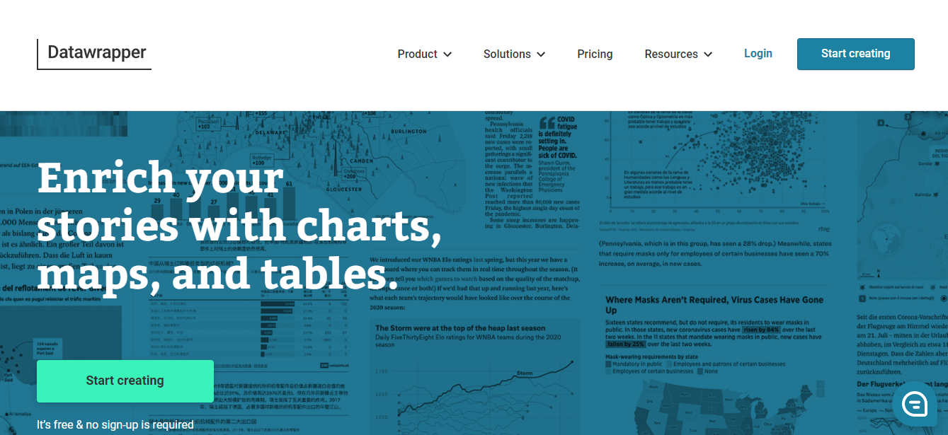
DataWrapper is a data visualization tool for creating charts, maps, and tables. All charts created with DataWrapper are mobile responsive and the visualizations adjust to different screen sizes by minimizing lines and shrinking empty spaces.
Datawrapper looks the closest like visualizations used by news organizations. The designs are conservative and focus more on the content.
Pricing:
- Free – $0/month
- Custom – $599/month
- Enterprise – Custom
My take on pricing: it's very much bifurcated in such a way that they want to release the free product to the masses, but then work with larger organizations for custom implementations. There's not really an in-between plan for small businesses, agencies, or in-house teams that aren't looking to go all-in on this.
Top Features:
- Interactive maps for anywhere in the world
- Highly interactive charts and tables
- Drag-and-drop
Full Pricing and Features Table
| Free | Custom | Enterprise |
|---|---|---|
| $0/month | $599/month | Custom price |
| Publish unlimited visualizations | Includes full design customization | All features of Free & Custom |
| Export visualizations as PNG | Export as PNG, SVG & PDF | Self-hosting of visualizations |
| Includes “Created with Datawrapper” attribution | 10 user licenses included | On-premise installation available |
| No “Created with Datawrapper” attribution | Service & support SLA agreements available |
3. Tableau – best for desktop-based visualization and dashboards

Tableau is a data visualization tool that can be used by data analysts, scientists, statisticians, etc. to visualize the data and get a clear opinion based on the data analysis. It allows its users to prepare, clean, and format their data and then create data visualizations to obtain actionable insights that can be shared with other users. Tableau is available for individual data analysts or at scale for business teams and organizations.
Pricing:
- Viewer – $15/month
- Explorer – $42/month
- Creator – $70/month
Top Features:
- Numerous data connections
- Drag-and-drop integration
- Mobile optimized designs
Full Pricing and Features Table
| Viewer | Explorer | Creator |
|---|---|---|
| $15/month | $42/month | $70/month |
| View lineage and impact | Manage users and permissions | Advanced Server Deployment Monitoring |
| Interact with visualizations and dashboards | Curate and share data sources | Programmatic Content Migration |
| Create and share custom views | Manage content and certify data sources | Create and publish new workbook with a new data source |
| Download visualizations as images | Author from curated data | Create and publish new data sources |
| Download summary data | Server administration | Create new workbooks based on pre-built Dashboard Starters |
| See data quality warnings | Set data quality warnings | Edit and modify a data flow |
| Export data | ||
| Create new data flows | ||
| Monitor flow performance and health |
4. Infogram
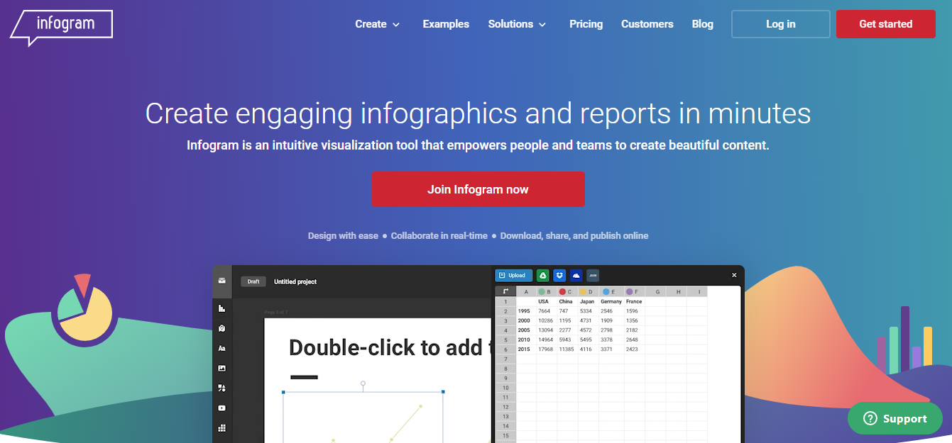
Infogram is a fully-featured drag-and-drop visualization tool that allows even non-designers to create effective visualizations of data for marketing reports, infographics, social media posts, maps, dashboards, and more.
Downside: I'm not a fan of how if you ever decide to cancel a pro plan, that there are elements of the embedded chart that will default to the free plan, including an in-your-face Infogram logo.
Pricing:
- Basic – $0/month
- Pro – $25/month
- Business – $79/month
- Team – $179/month
- Enterprise – Custom
Top Features:
- Drag and drop editor
- API for importing additional data sources
- Very powerful and customizable
Full Pricing and Features Table
| Basic | Pro | Business | Team | Enterprise |
|---|---|---|---|---|
| $0/month | $25/month | $79/month | $179/month | Custom Price |
| 37+ interactive charts types | Up to 100 projects | Up to 1,000 projects | Up to 3,000 projects | Up to 10,000+ projects |
| Up to 10 projects | Up to 10 pages per project | Unlimited pages per project | Single team functionality starting with 3 users | Branded public profile and subdomain |
| Up to 5 pages per project | 100+ premium templates | Your brand logo, color palette, fonts, and image assets | Real-time collaboration | Multiple team functionality starting with 10 users |
| 13 map types | 550+ map types | Your own logo | Commenting | Advanced training & dedicated account manager |
| Publish your content online | 1 million images and icons available | Basic analytics | Engagement analytics | First Priority support |
| Import data | Set your favorite colors, fonts, and images | SQL Connectors, Iframe integrations | Tracking links | Custom design implementation and team templates |
| Object animations | Advanced image editing features | Version history | Export interactive charts and maps for offline use. | |
| Download HD images and videos | Callouts, custom links and page linking | Custom development | ||
| Privacy control | SSO | |||
| Data connections and live data | 99.9% uptime SLA | |||
| Web tracking opt out |
5. ChartBlocks
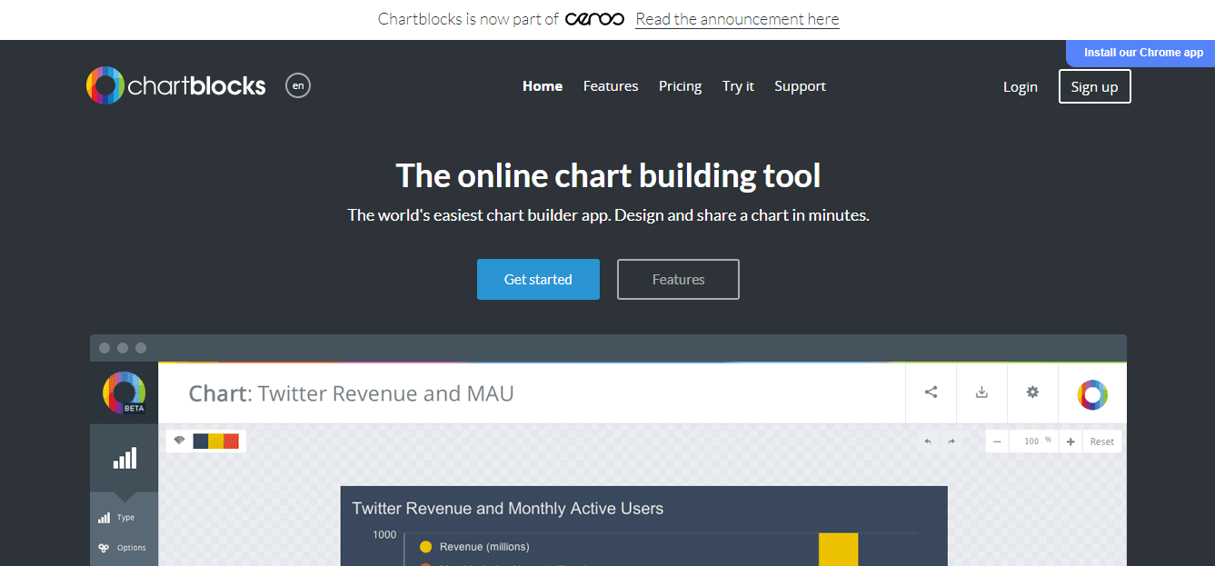
Chartblocks is a cloud-based data visualization tool for SMB to large companies. The platform offers different chart types for your data and contains pre-made templates with editable sizes, colors, fonts, grids, and legends.
Pricing:
- Personal – $0/month
- Professional – $20/month
- Elite – $65/month
Top Features:
- Social media integrations
- Chart building wizard
- Multiple file support
Full Pricing and Features Table
| Personal | Professional | Elite |
|---|---|---|
| $0/month | $20/month | $65/month |
| Up to 50 active charts | All the features of personal | All the features of professional |
| Export charts to PNG images | Up to 75 active charts | Up to 200 active charts |
| Export charts as vector graphics (.eps, .pdf, .svg) | Unlimited additional users | API access |
| Make your charts private | Remove branding | Charts automatically poll for new data |
| Hide sharing buttons |
6. Sisense
Sisense is a business intelligence tool for creating data visualizations that help gain business insights. Technically, Sisense is for creating dashboards. But the tool’s capabilities go beyond that. This data visualization tool is specially created to visualize large amounts of data.
Pricing:
Get a price quote here
Top Features:
- Custom UI to deliver branded analytic experiences
- A dedicated portal for developer content
- Self-service dashboards
7. Zoho Analytics – a contender if using Zoho ecosystem
Zoho Analytics is the best option for beginners. It’s easy to use and built for non-technical users. You can import and blend data from virtually any source, including databases, cloud storage, websites, and other business applications you use to power your business.
Pricing:
- Basic – $30/month
- Standard – $60/month
- Premium – $145/month
- Enterprise – $575/month
Top Features:
- Embedded BI
- Flexible deployment options
- Unified business analytics
Full Pricing and Features Table
| Basic | Standard | Premium | Enterprise |
|---|---|---|---|
| $30/month | $60/month | $145/month | $575/month |
| 2 Users | 5 User | 15 Users | 50 Users |
| 0.5 Million Rows | 1 Million Rows | 5 Million Rows | 50 Million Rows |
| Unlimited Reports and Dashboards | Hourly data sync | Advance Data Preparation | 5x Performance |
| 250+ Data Connectors | Data Alerts | Zia Insights | 1 Analytics Portal |
| Daily Sync | Data Snapshots | Private Links | Live Chat Support |
| Ask Zia | Advanced Slideshow | Analytics Portal add-on | |
| Slideshow | Groups Support | Logo Rebranding | |
| Live connect | Administrator Roles | Activity Logs | |
| Data Backup | Premium support add-on | ||
| Access Logs |
8. Chartio
Chartio data visualization software provides the insights and analytics that businesses rely upon to understand and grow their business. Companies of all sizes use this cloud-based software to explore and transform data into engaging visualizations. However, it focuses on small and mid-sized organizations.
Pricing:
- Startup – $40/month
- Growth – $60/month
- Premium – Custom
Top Features:
- Multiple data sources and connections
- Reports interface
- Attractive graph and chart formats.
Full Pricing and Features Table
| Startup | Growth | Premium |
|---|---|---|
| $40/month | $60/month | Custom price |
| Unlimited charts and dashboards | Everything from Startup plan | Everything from Growth Plan |
| Scheduled email reports | Chat support | Dedicated technical Data Advisor |
| Data Stores | Alerts | Advanced query log |
| Email support | Amazon Redshift | Single sign-on authentication |
| 20+ cloud database connections | Google BigQuery | Embedding |
| Google Sheets | Panoply | API access |
| CSVs | Snowflake | Higher query limits |
9. Cluvio
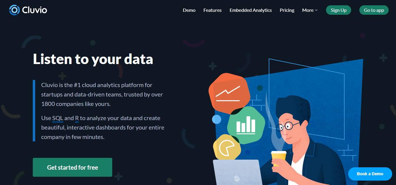
Cluvio is the perfect solution for small data-driven companies and fast-growth startups interested in deeper performance insights. With it, you get everything you need to build a growth-ready infrastructure and make data-heavy decisions that will help drive your business forward.
Pricing:
- Free – $0/month
- Pro – $279/month
- Business – $669/month
- Enterprise – $2250/month
Top Features:
- Sharing dashboards
- Custom analytic dashboards
- Real-time data
Full Pricing and Features Table
| Free | Pro | Business | Enterprise |
|---|---|---|---|
| $0/month | $279/month | $669/month | $2250/month |
| 3 Dashboards | 50 Dashboards | 100 Dashboards | Unlimited Dashboards |
| Data processing in R | Data processing in R | Data processing in R | Data processing in R |
| 1000 query executions / mo. | Unlimited query executions | Unlimited query executions | Unlimited query executions |
| All analytical capabilities | 20 SQL alerts | Unlimited SQL alerts | Unlimited SQL alerts |
| 20 dashboard schedules | 50 dashboard schedules | Dashboard schedules: Contact us | |
| Dashboard sharing | Dashboard sharing with parameters | Dashboard sharing with parameters | |
| 2 analyst users | External and embedded sharing | External and embedded sharing | |
| Unlimited viewer users | Unlimited viewer users | Unlimited viewer users | |
| 5 analyst users | Analyst users: Contact us | ||
| 10 user groups | User groups: Contact us | ||
| IP restricted sharing | IP restricted sharing | ||
| Premium support | Enterprise SLA support | ||
| HIPAA Compliance as add-on | HIPAA Compliance | ||
| Private cloud installation | |||
| White-labeling | |||
| Customer success manager |
10. Whatagraph
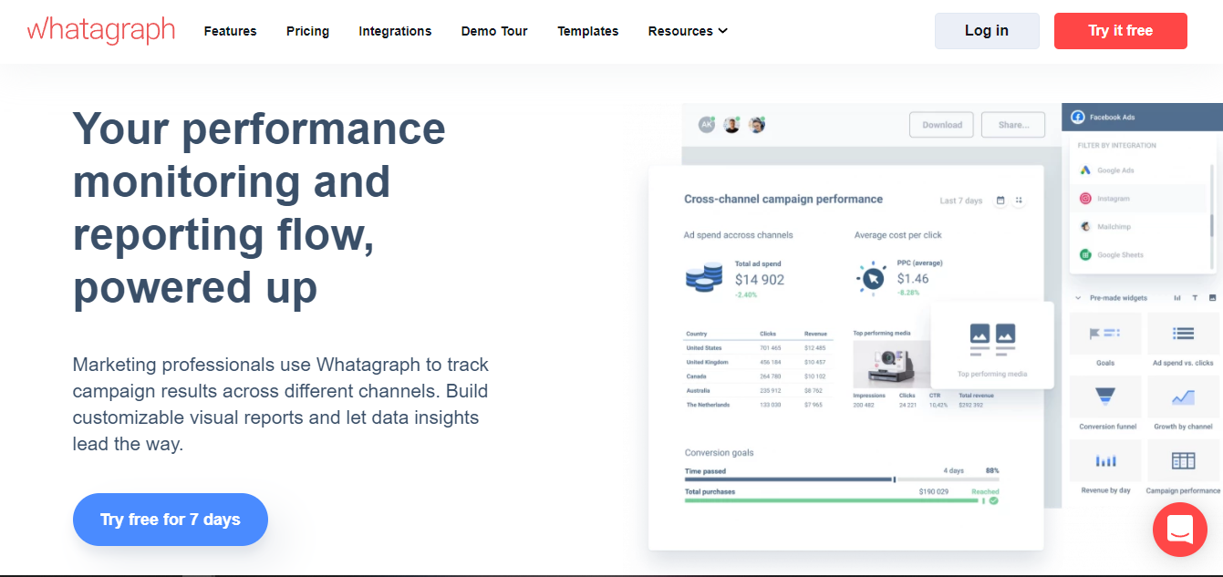
Whatagraph is the perfect reporting solution If you’re a marketer or digital marketing agency. Whatagraph is an excellent, automated solution to deliver multi-source reports that are easy to read and understand from a non-marketing perspective.
Pricing:
- Professional – $119/month
- Premium – $279/month
- Growth – $699/month
Top Features:
- Cross-channel reporting
- Add custom data
- Pre-made templates and widgets
Full Pricing and Features Table
| Professional | Premium | Growth |
|---|---|---|
| $119/month | $279/month | $699/month |
| 1 user | 5 users | Custom users |
| 15 data sources | 50 data sources | Custom data sources |
| Live chat support | Dedicated account manager | Dedicated account manager |
| Custom branding | Custom branding | |
| Multisource reporting | Multisource reporting | |
| Public API |
Last Updated on May 28, 2024 by Joe